It is one of the most common and frustrating scenarios in the digital age: a business invests significant resources into a visually stunning, technically sound website, only to watch it fail at its most crucial task-generating leads and sales. The buttons are beautiful, the animations are smooth, but the conversion rate remains stubbornly flat. This experience leads many to question their design choices, their marketing budget, or even their product. The problem, however, often lies deeper than aesthetics. The issue isn't the design's beauty, but its lack of psychological empathy.
The most successful websites are not just digital brochures; they are carefully engineered environments that understand and guide human behavior. They recognise that a user's decision to click "buy," "subscribe," or "contact us" is rarely a purely logical one. Instead, it is the culmination of a series of subconscious cues, mental shortcuts, and emotional triggers. True conversion power is unlocked when the art of design is fused with the science of psychology. This is the bridge between a website that simply displays information and one that actively persuades.
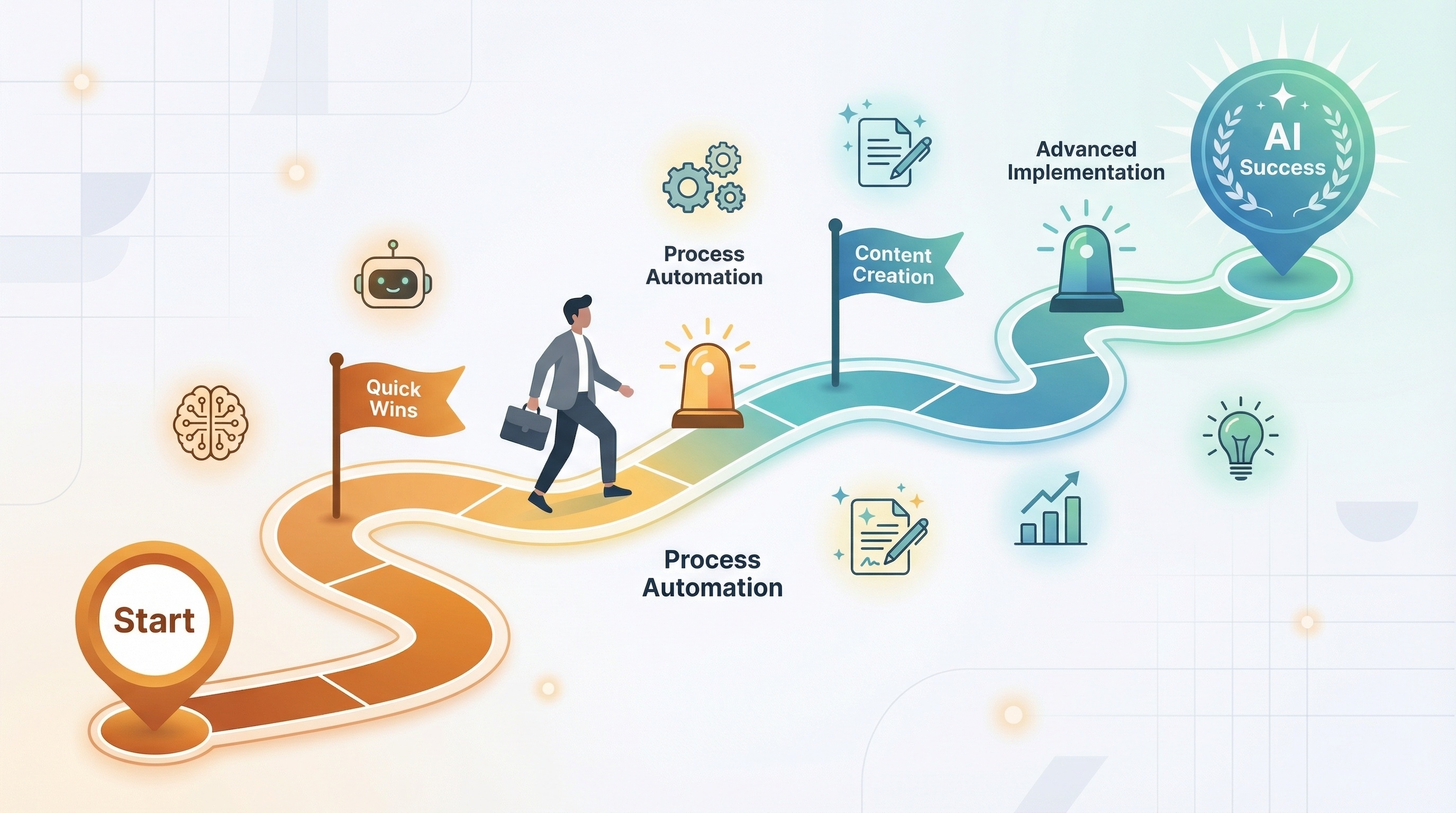
This report will guide you across that bridge. We will deconstruct the psychological architecture of a high-converting website, moving from foundational principles to practical application. First, we will explore the universal levers of persuasion that shape human interaction. Next, we will delve into the specific cognitive biases-the mental shortcuts users take-that influence their decisions online. We will then translate this theory into practice with the principles of Conversion-Centered Design, showing how to build these psychological triggers into the very fabric of a webpage. Finally, we will demonstrate how to measure the impact of these strategies, turning hypotheses into data-driven certainties.
At The Website Design Agency, we believe that building a website that performs for everyone-users and search engines alike-requires this deeper, more strategic approach. It is about moving beyond what looks good to understand what truly connects and converts.
At the heart of modern persuasion science is the groundbreaking work of Dr. Robert Cialdini. His research identified universal principles of influence that, far from being manipulative tricks, are fundamental to human interaction. Understanding these levers allows us to create more effective, intuitive, and user-centric digital experiences. When a user feels understood and respected, they are far more likely to say "yes."
The principle of reciprocity is woven into the fabric of human society: when someone does something for us, we feel a powerful, often subconscious, obligation to do something for them in return. It is a drive to maintain social balance and settle debts. In a digital context, this means that if you provide genuine value to a user upfront, they will feel more compelled to give you something in return, such as their email address, their time, or their business. The key to unlocking this principle is to give first, and to do so in a way that is perceived as valuable, personalised, and unexpected.
This goes far beyond a simple "Sign up for our newsletter" pop-up. Effective digital reciprocity involves offering a tangible gift. This could be a comprehensive, free resource like a detailed eBook, an industry whitepaper, or a practical checklist. It could also be a risk-free trial of a service or a product discovery quiz that helps a user solve a problem. For example, the coffee roaster Blue Bottle Coffee offers extensive, free "Brew Guides" that teach customers how to make the perfect cup of coffee, positioning themselves as helpful experts and seamlessly promoting their own products in the process.
The power of this principle is directly proportional to the perceived value and unexpectedness of the gift. A famous study involving waiters and dinner mints perfectly illustrates this. Giving diners a single mint-an expected gesture-increased tips by about 3%. Giving two mints increased tips by 14%. But the most significant effect came when the waiter gave one mint, walked away, then turned back and said, "For you nice people, here's an extra mint." This small act, which was both personalised and unexpected, caused tips to skyrocket by 23%. This demonstrates that a generic, low-value offer will trigger a weak response. A high-value, specific, and seemingly personalised offer, like the £125 complimentary exfoliator offered by the lifestyle brand goop with a beauty purchase, creates a much stronger sense of obligation and fosters significant brand loyalty.
It is an intuitive truth that we are more likely to agree to requests from people we know and like. This is the Liking Principle. In marketing, this doesn't mean your brand needs to be your customer's best friend, but it does need to be likable. The primary drivers of likability are similarity (we like people who are like us), compliments, cooperation towards mutual goals, and physical attractiveness-which, in the digital world, translates directly to a beautiful, well-designed, and user-friendly website. A visually appealing and easy-to-navigate site signals quality and trustworthiness, making the brand itself more likable.
A brand can build this connection by crafting an "About Us" page that showcases the real people behind the business, complete with photos and authentic stories. It involves developing a brand voice that uses the same language and tone as its target audience, creating a sense of similarity and understanding. Brands can also demonstrate cooperation by aligning with causes their customers care about, showing that they share the same values. For instance, Bench Accounting's campaign to help small businesses secure funding during the pandemic was a powerful signal that they shared their customers' struggles and values, fostering a deep sense of connection.
Ultimately, the Liking Principle is about establishing identity resonance. A user doesn't just buy a product; they buy an improved version of themselves or an affirmation of their identity. The brand GoPro, for example, doesn't just sell cameras; its marketing is filled with awe-inspiring visuals of adventure and courage, making the user feel more adventurous by association. Similarly, the digital marketing company Ahrefs uses a likable mascot and clean, visually appealing branding to create a positive and trustworthy persona that users are drawn to. When a website's visual language, imagery, and tone all work together to communicate, "We are like you, and we understand you" , it builds a bond that transcends a simple transaction.
When faced with uncertainty, humans have a powerful instinct: to look at what others are doing. This mental shortcut, known as Social Proof, is one of the most potent forces in conversion. We assume that if many other people are making a certain choice, it must be the correct one. This is why we choose the busy restaurant over the empty one or read online reviews before making a purchase. For a website, providing clear and compelling social proof is essential for building trust and validating a user's decision to convert.
The applications of social proof online are vast and varied. The most common forms are customer testimonials and reviews, which are incredibly powerful; research shows that 88% of consumers trust online reviews as much as they trust personal recommendations from friends or family. Other effective methods include displaying hard data ("Join over 10,000 satisfied customers"), showcasing the logos of well-known clients or media outlets where the brand has been featured ("As seen in Forbes"), and even showing real-time activity notifications ("Sarah from Manchester just bought this item").
The effectiveness of social proof is amplified by specificity and relatability. A classic study on encouraging hotel guests to reuse their towels illustrates this perfectly. A generic appeal to "help the environment" had a modest effect. However, a sign that said, "The majority of guests who stay at this hotel recycle their towels," increased compliance by 34%. An even more specific message -- "8 out of 10 guests who stayed in this room reused their towels" --was more effective still. The more relatable the group, the stronger the pull to conform. This is why showcasing testimonials from customers in the same industry or demographic as your target user can be exceptionally persuasive.
From a young age, we are taught to respect and follow the guidance of authority figures -- parents, teachers, and experts. This deference to authority is a highly efficient mental shortcut; instead of analyzing every detail of a complex situation ourselves, we trust the judgment of those who are more knowledgeable or experienced. On a website, establishing this sense of authority is critical for building the trust required for a user to convert. When a brand is perceived as a credible expert, its recommendations and calls to action carry significantly more weight.
Authority is not simply claimed ("We are the experts!"); it must be signaled and demonstrated. These signals can be visual, such as a polished, professional, and error-free website design that communicates competence and attention to detail. They can be titular, like showcasing the PhDs, certifications, or executive titles of the team. And they can be what Cialdini calls "trappings" --the logos of prestigious clients, industry awards, and security badges that signify credibility. For example, a B2B company that runs review generation campaigns on respected platforms like G2 and Capterra is actively building its authority signals.
A powerful case study in authority is the personal brand of marketing expert Neil Patel. His website masterfully layers authority signals: his title as co-founder of successful companies, logos of prominent clients like Amazon and HP, features in The Wall Street Journal, and even recognition from President Obama and the United Nations. This creates an overwhelming and persuasive aura of expertise. Furthermore, authority can be transferred. When a highly respected industry publication links to your site, or a well-known expert endorses your product, their credibility is transferred to your brand. Therefore, a comprehensive authority strategy involves not only building signals into your own website but also executing a content and PR strategy designed to earn these valuable third-party endorsements.
People tend to desire things more when their availability is limited. This is the Scarcity principle, and its power is rooted in a fundamental cognitive bias known as Loss Aversion. Psychologically, the pain of losing something is about twice as powerful as the pleasure of gaining something of equal value. When an item is scarce, we focus not on what we might gain by acquiring it, but on what we might lose if we fail to act. This "Fear of Missing Out" (FOMO) is a potent motivator that compels immediate action.
In digital marketing, scarcity is typically applied in three ways. The first is limited-quantity scarcity, communicated with messages like "Only 2 left in stock!" or "Limited edition". The second is limited-time scarcity, which uses countdown timers for flash sales or deadlines for offers. The third is limited-access or exclusivity, where a product or service is only available to a select group, such as the invite-only model used by Clubhouse in its early days or the limited-edition sneaker "drops" on Nike's SNKRs app.
Travel booking sites like Booking.com are masters of this principle. They expertly combine scarcity ("Only 1 room left at this price") with social proof ("12 people are looking at this property right now") and urgency ("This property was booked 5 times in the last 24 hours") to create an intense psychological pressure to book immediately before the opportunity is lost. This strategy is highly effective because it implies high demand and value, triggering FOMO. However, the power of scarcity is directly tied to its credibility. Users have become wary of deceptive tactics like countdown timers that reset on every page refresh. Using fake scarcity can severely damage brand trust and lead to long-term negative perception. Therefore, it is crucial to use only genuine scarcity -- linking stock counters to real-time inventory or running legitimate, time-bound promotions -- to create urgency without sacrificing customer trust.
Humans have a deep psychological need to be, and to appear, consistent with what they have previously said or done. Once we make a choice or take a stand, we feel internal and external pressure to behave consistently with that commitment. This principle is the engine behind the "foot-in-the-door" technique: by getting a user to agree to a small, low-friction request first, you make them psychologically more likely to agree to a larger, more significant request later. Each small "yes" paves the way for the ultimate "yes."
On a website, this means designing a user journey that functions as a "commitment ladder." Instead of immediately asking for the sale or a demo booking, the journey begins with a micro-commitment. This could be signing up for a newsletter, taking a short, engaging quiz, downloading a free resource, or creating a wish list on an e-commerce site. Once a user has made this initial investment of time or information, their self-perception begins to shift. They are no longer a passive visitor; they are an engaged participant. This makes them more receptive to the next, larger step in the conversion funnel.
The power of this principle is amplified when the commitment is active (requiring a click or typing, not just passive agreement), public (visible to others), and effortful. A private commitment is easier to abandon than a public one, which engages our desire to maintain a consistent social identity. For instance, the cosmetics brand Benefit ran a campaign encouraging users to post photos of themselves with the hashtag #realsies, creating a powerful public commitment to the brand. Similarly, the more effort a user invests -- like completing a detailed style quiz for the personal styling service Stitch Fix -- the more they value the outcome and feel committed to the process. This "IKEA effect" suggests that designing user journeys with a sequence of small, active, and increasingly effortful steps can systematically build commitment and guide users toward conversion.
The Unity principle is the most recent addition to Cialdini's framework and perhaps the most profound. It posits that we are most influenced by people with whom we share an identity. This goes beyond simple similarity (the Liking principle) to a powerful sense of belonging -- the feeling that someone is "one of us." When a message comes from a member of our perceived tribe, we don't just evaluate it on its merits; we are inclined to accept it because it comes from a trusted in-group source.
In a digital context, brands can cultivate this sense of unity by building genuine communities. This could be a private Facebook group, a dedicated Discord server, or a forum where customers can connect with each other and the brand around a shared interest or purpose. The language a brand uses is also critical. Using inclusive terms like "we," "us," and "our community" reinforces a shared identity. For example, a brand targeting entrepreneurs might use copy like, "For founders like us, the hustle never stops." This creates an immediate sense of kinship.
Furthermore, brands can foster unity through co-creation. This involves inviting users to participate in the brand's journey, whether by voting on new product designs, submitting ideas, or participating in beta testing programs. When users feel they have a stake in the brand's evolution, their sense of shared identity deepens. They are no longer just customers; they are partners and advocates. This creates a powerful and resilient bond that is highly resistant to competitive pressures and is a cornerstone of long-term brand loyalty.
While the principles of persuasion provide a macro framework for influence, understanding conversion requires a micro-level look inside the user's brain. Nobel laureate Daniel Kahneman's research identified two modes of thought: System 1, which is fast, intuitive, and automatic; and System 2, which is slow, deliberate, and analytical. Most of our daily decisions, including many we make online, are governed by the effortless System 1. This system relies on mental shortcuts, or heuristics, known as cognitive biases. These biases are not flaws; they are essential for navigating a complex world. A high-converting website understands these biases and designs an experience that appeals directly to the user's intuitive System 1 thinking.
The Anchoring Bias describes our tendency to rely too heavily on the first piece of information we receive when making decisions. This initial piece of information, the "anchor," frames all subsequent judgments. This bias is most commonly exploited in pricing strategies. When an e-commerce site displays a higher, slashed-out price next to the current sale price (e.g., £100 £75), the original £100 price acts as an anchor. This makes the £75 sale price seem significantly more valuable and like a better deal than if it were presented alone. The first number anchors the user's entire perception of the product's value, making the decision to purchase feel more rational and justified.
As discussed with the Scarcity principle, the pain of losing is a far more powerful psychological motivator than the pleasure of gaining. This is Loss Aversion, and it is the engine that drives the "Fear of Missing Out" (FOMO). Websites leverage this bias by framing offers not in terms of what the user will gain, but what they stand to lose. A message like "Gain 3 years of life if you stop smoking" is less effective than "Lose 3 years of life if you don't stop". On a website, this translates to copy like "Don't miss your chance to save 50%" or countdown timers on limited-time offers that visually represent the opportunity slipping away. This triggers an urgent, System 1 response to act now to avoid the pain of a potential loss.
Confirmation Bias is our natural tendency to seek out, interpret, and remember information that confirms our existing beliefs or values. We are wired to want to be right. For a website, this means that conversion is more likely when the site's messaging aligns with the pre-existing worldview of its target audience. If a user who values environmental sustainability lands on a website, they will actively look for signals that the brand shares their values. By prominently featuring eco-friendly practices, sustainable material sourcing, or charitable partnerships related to conservation, the website confirms the user's belief that this is a "good" company. This reassures them that choosing this brand is the "right" decision, reducing cognitive dissonance and making the path to conversion smoother.
The human brain processes and retains visual information far more effectively than text. This is the Picture Superiority Effect. According to dual-coding theory, images are stored in our memory both as a picture and a verbal code, making them much easier to recall than words alone. With users often spending less than 10 seconds on a page before deciding to stay or leave, this bias is critical. A powerful hero image, a clear illustration, or an insightful graph can communicate a brand's core value proposition instantly, long before a visitor has read a single line of text. Using high-quality, relevant visuals is not merely decoration; it is one of the most efficient ways to capture attention and convey a message to the fast-acting System 1 brain.
We place a disproportionately high value on things we have invested effort in creating (the IKEA Effect) or things we feel we already possess (the Endowment Effect). This sense of ownership and personal investment creates a powerful psychological bond. Websites can leverage this by incorporating interactive elements that require user participation. Product configurators that allow users to "build their own" car or customise a pair of sneakers are classic examples. Even simpler tools, like an interactive quiz that provides a personalised result, make the user an active co-creator. This effort, however small, fosters a sense of ownership over the outcome, making the user more committed to the brand and more likely to follow through with a purchase to fully realise the value of their "creation."
Understanding the psychological levers and cognitive biases is the first step. The second, more practical step is translating that knowledge into tangible design choices. This is the domain of Conversion-Centered Design (CCD), a framework that systematically applies psychological principles to guide users toward a conversion goal. It is the bridge between theory and a high-performing website.
The human brain has limited attention. When presented with too many choices, we often experience "analysis paralysis" and make no choice at all. The foundational principle of CCD is therefore to create focus. Every page should have one primary goal, and every design element should serve that goal. This is measured by the "Attention Ratio": the ratio of links on a page to the number of conversion goals. For a high-converting landing page, this ratio should be 1:1.
To achieve this singular focus, designers use several techniques. Encapsulation involves creating a visual container -- like a colored box or a distinct background shape -- around the call-to-action (CTA) and its related content, signaling its importance. Contrast and color are used to make the primary CTA button visually distinct from every other element on the page, drawing the eye irresistibly towards it. Finally, generous use of white space (or negative space) around the CTA reduces visual clutter and makes the desired action feel clear, simple, and inviting.
A well-designed page doesn't leave navigation to chance; it actively guides the user's journey. By building a clear visual structure, a website can tell a story and lead the visitor's eye from the value proposition to the final call-to-action. This is achieved through a strong visual hierarchy, where elements are prioritised using font size, weight, and color to show users what to read first, second, and third.
In addition to hierarchy, CCD employs directional cues to draw attention to the most important elements. These can be explicit, like arrows or lines that physically point to the CTA button. They can also be implicit and more subtle. For example, if a photograph of a person is used on the page, the direction of their eye gaze is a powerful cue; users will instinctively look where the person in the photo is looking. By positioning the CTA in their line of sight, a designer can subtly direct user attention right where it needs to be.
Trust is the currency of the web. Without it, no conversion can happen. CCD operationalises the psychological principles of Social Proof and Authority to build this trust visually and strategically. It's not enough to simply have testimonials or client logos; they must be placed where they will have the most impact. The most effective placement for these trust signals is near points of friction -- areas in the user journey where a visitor might feel doubt or hesitation. This includes checkout pages, lead generation forms, and right next to the primary CTA button. By placing a reassuring customer review or a "Verified & Secure" badge next to a "Buy Now" button, a designer can preemptively address user anxiety and increase their confidence to click.
Every unnecessary step, confusing form field, or second of loading time is a point of friction that can kill a conversion. The goal of CCD is to make the path to "yes" as smooth and effortless as possible. This involves a ruthless audit of the user journey to eliminate any and all obstacles. Forms should be simplified, asking only for essential information; for more complex processes, long forms can be broken down into multiple, less intimidating steps. Page speed must be optimised, as slow load times are a major source of user frustration and a direct cause of high bounce rates. This is so critical that Google now includes it as a key ranking factor in its Core Web Vitals algorithm. Finally, the entire experience must be seamless on mobile devices, with intuitive navigation and easily tappable buttons, ensuring that friction is minimised for every user, regardless of how they access the site.
To persuade users, a website must clearly communicate its value. CCD dictates that visuals should be used not just to show the product, but to show the benefit or outcome of using that product. A skincare brand, for example, should show a photo of a person with radiant, healthy skin -- the desired end result -- rather than just a picture of the bottle. This helps the user visualise the positive change the product will bring to their life.
Finally, this entire experience must be wrapped in a layer of consistency. The brand's visual language -- its colors, typography, and logo usage -- should be consistent across every page of the website and all external marketing materials, from social media ads to email newsletters. This consistency builds brand recognition and fosters a sense of professionalism and reliability. When a user clicks an ad and lands on a page that looks and feels exactly as they expected, it reduces cognitive load and reinforces the trust needed to move forward with a conversion.
The principles of psychology and Conversion-Centered Design provide a powerful toolkit for influencing user behavior. However, their application should not be based on guesswork. A truly expert approach is data-driven, treating each design choice as a testable hypothesis. By employing the scientific method, we can move from "I think this will work" to "I know this works," systematically optimizing a website for maximum performance.
A/B testing, or split testing, is the core process for validating design hypotheses. It involves creating two versions of a webpage -- a control (the original version, 'A') and a variation (the new version with a specific change, 'B'). Traffic is then split between the two versions, and user behavior is measured to see which one performs better against a specific conversion goal. This process allows designers to isolate the impact of a single change, providing definitive proof of what works and what doesn't.
This data-driven approach follows a simple but powerful loop: Diagnose -> Hypothesize -> Validate. First, analytics and user behavior tools are used to diagnose a problem area on the website, such as a page with a high bounce rate or a low click-through rate on a key button. Second, the psychological principles discussed in this report are used to form a hypothesis. For example: "We believe that the current CTA button lacks visual prominence (Focus principle). By changing its color to a high-contrast orange and increasing its size, we will draw more attention to it and increase clicks." Finally, an A/B test is run to validate this hypothesis with real user data. This rigorous process transforms design from a subjective art into an objective science. The results of such tests can be dramatic, as demonstrated by numerous real-world case studies.
To effectively diagnose problems and identify opportunities for A/B testing, it is essential to visualise the user's journey. The conversion funnel is the primary tool for this task. It is a chart that illustrates the flow of users through a series of predefined steps toward a conversion goal, such as making a purchase or signing up for a service. By mapping out this journey, businesses can see exactly where users are "leaking" or dropping out of the process. These drop-off points represent the biggest opportunities for optimisation.
For example, an e-commerce funnel might track users from their initial homepage visit all the way to a completed purchase. By analyzing the percentage of users who successfully move from one stage to the next, a business can pinpoint critical points of friction. A large drop-off between viewing a product and adding it to the cart might suggest issues with pricing, product descriptions, or a lack of social proof. A significant drop-off at the final checkout stage could indicate unexpected shipping costs, a complex form, or a lack of trust signals like security badges. The funnel provides a clear, high-level roadmap for where to focus optimisation efforts.
A website that successfully converts is more than a collection of attractive pages; it is a cohesive psychological experience. It understands that behind every click is a complex interplay of motivations, biases, and emotions. By moving beyond mere aesthetics to embrace the principles of persuasion and human psychology, it is possible to build digital platforms that do not just display information, but actively connect with users, build trust, and guide them confidently toward a "yes."
This is the strategic approach The Website Design Agency brings to every project. We believe that the most powerful websites are those built with a deep understanding of the people who use them. By blending design expertise with a rigorous, data-validated psychological framework, we build websites that deliver tangible, measurable results for our clients.
Wondering where the psychological "leaks" are in your own website? Book a free, no-obligation UX + Psychology Audit. We'll analyze your user journey and identify three key opportunities to improve your conversion rate, providing immediate, actionable value to help you turn more visitors into customers.