The internet is the gateway to modern life. It’s where we shop, learn, work, bank, and socialise. But for millions of people, navigating the web is still harder than it should be. According to the UK government, 1 in 5 people in the UK have a disability - whether that’s visual, auditory, motor, or cognitive. That’s around 14 million people who could be struggling to interact with digital products if accessibility isn’t built in.
Accessibility isn’t just about ticking compliance boxes. It’s about ensuring that every single visitor has an equal chance to use your site. When you prioritise accessibility, you’re not only opening your doors to a wider audience - you’re also signalling that your business values inclusivity, fairness, and trust.
And there’s a business case, too. Accessible websites:
Accessibility is not a “nice-to-have.” It’s essential.
In the UK, accessibility isn’t optional. The Equality Act 2010 requires businesses to make “reasonable adjustments” so that disabled people are not disadvantaged when accessing services, including websites.
Public sector organisations face even stricter requirements under the Public Sector Bodies Accessibility Regulations (2018), which mandate compliance with WCAG 2.1 AA standards. Private businesses are not yet bound to the same legal standards, but ignoring accessibility exposes you to reputational risk and potential legal claims.
Globally, the Web Content Accessibility Guidelines (WCAG) set the gold standard. The latest version, WCAG 2.2, expands protections and recommendations, particularly for users with cognitive and motor disabilities.
But beyond laws and guidelines, there’s an ethical imperative: the internet is for everyone. When you design inclusively, you’re not doing anyone a favour - you’re fulfilling a responsibility.
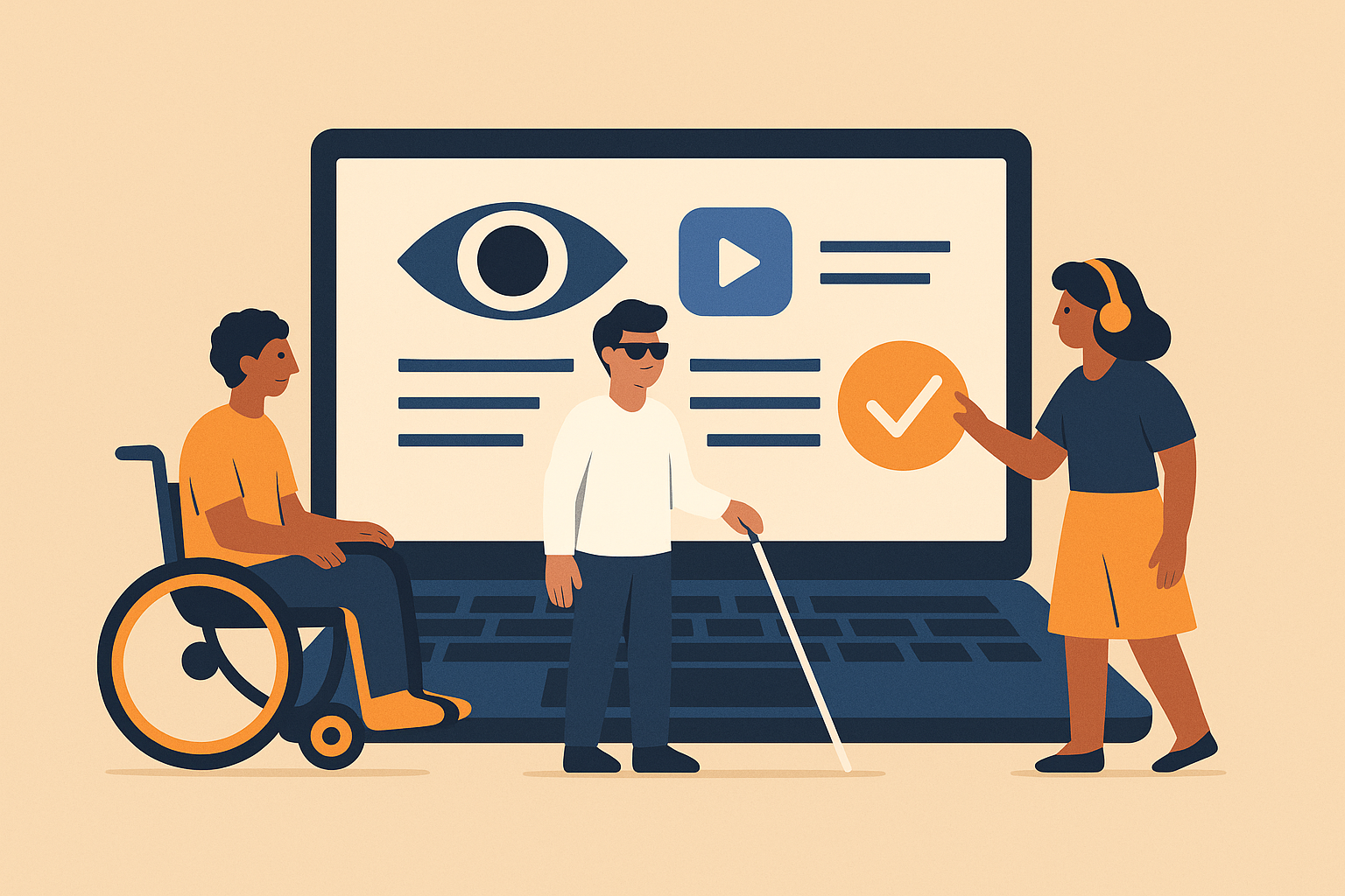
The most widely accepted framework for accessibility is POUR - Perceivable, Operable, Understandable, Robust.
Information must be available to the senses. For example:
Example: BBC iPlayer provides subtitles on nearly all its programmes, catering to the deaf and hard of hearing.
Users must be able to interact with your site.
Example: GOV.UK sites are built with full keyboard operability, ensuring equal access to public services.
The site should behave in predictable ways.
Example: The NHS website uses straightforward, conversational language, making health information clear and accessible.
Content should be usable across a range of technologies.
Accessibility starts at the design stage - not as an afterthought.
Poor contrast is one of the most common accessibility failures. WCAG requires a contrast ratio of at least 4.5:1 for body text. Free tools like the WebAIM Contrast Checker make this easy to test.
Tip: Never rely on colour alone to convey information. Instead of “required fields are marked in red,” use both colour and an asterisk.
Readable typography is crucial:
Flexible, responsive layouts aren’t just about mobile. They also help users who zoom in or use larger text settings.
Example: GOV.UK’s design system specifies responsive, mobile-first layouts that adapt gracefully to different user needs.
Developers play a huge role in accessibility.
Using the correct HTML tags (e.g., <nav> for navigation, <main> for main content) makes it easier for assistive tech to interpret structure.
Accessible Rich Internet Applications (ARIA) attributes provide additional context. But misuse is common. Rule of thumb: don’t use ARIA when native HTML does the job better.
Forms are often the most frustrating part of a site for disabled users. Best practices include:
Screen readers like NVDA (Windows) or VoiceOver (Mac/iOS) allow you to experience your site the way visually impaired users do. Testing should be routine, not a one-off.
Content creators also play their part.
Accessibility isn’t charity - it’s good business.
Google rewards accessible sites. Alt text, semantic HTML, and structured headings improve crawlability and relevance.
Features designed for accessibility often help everyone. Captions benefit not just deaf users but also people watching videos on mute in a noisy café. High contrast helps mobile users outdoors.
Inclusive design signals respect. Companies like Apple and Microsoft have made accessibility a core part of their brand identity, earning loyalty from millions of users.
Some must-have tools for testing accessibility:
Accessibility is not a checklist to complete once and forget. It’s an ongoing mindset that must be embedded into every stage of digital design and development.
When you design inclusively:
The internet should work for everyone. Make accessibility part of your DNA, and you’ll create experiences that truly welcome every user.