UX Patterns That Boost Conversions (Without Feeling Pushy)

Title: UX Patterns That Boost Conversions (Without Feeling Pushy)

In the competitive digital landscape, the drive for higher conversions is relentless. However, many businesses fall into the trap of using aggressive, pushy tactics that, whilst they might offer a short-term win, ultimately erode user trust and damage brand reputation.

The most sustainable and effective path to boosting conversions lies not in manipulation, but in empathy. It’s about creating a superior User Experience (UX) that supports and guides users, making it easy and reassuring for them to achieve their goals. This article takes a deeper dive into the specific, ethical UX patterns that achieve this, exploring the psychological principles that make them work and drawing detailed examples from the playbooks of Airbnb, Stripe, and Shopify.

The Ethical Compass: Guiding vs. Deceiving

Before we explore the patterns, it's crucial to understand the line between ethical persuasion and "dark patterns."

  • Supportive UX (Ethical Persuasion): This involves using design to provide clarity, remove friction, and build a user's confidence. The goal is to empower the user to make an informed decision that is right for them. The design is transparent, helpful, and user-centric.
  • Dark Patterns (Deception): These are tricks used in websites and apps that make you do things you didn't mean to, like buying or signing up for something. They leverage psychology to prey on user anxieties and assumptions. Common examples include:
    • Confirmshaming: Guilt-tripping a user for opting out (e.g., "No thanks, I hate saving money").
    • Hidden Costs: Revealing unexpected charges like delivery fees or taxes only at the final step of the checkout.
    • Sneak into Basket: Adding extra items to a user's shopping basket without their explicit consent.

Choosing supportive UX is not just an ethical decision; it's a strategic one that fosters long-term customer loyalty.

Pattern 1: Guided Forms – The Psychology of Effortless Completion

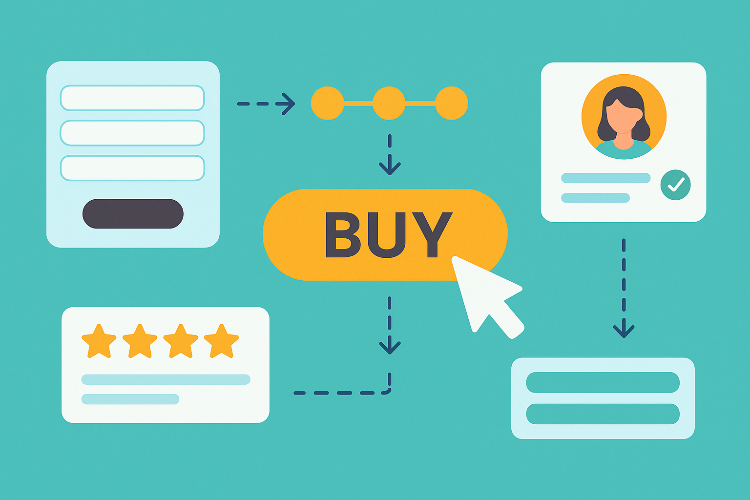
Forms are the final frontier for most conversions. This is where users commit, but it's also a major point of friction and abandonment. A guided form turns this potential obstacle into a smooth, satisfying final step.

The Psychology at Play:

  • Reduced Cognitive Load: Our brains have a limited amount of processing power. Long, complex, or confusing forms overwhelm users. Guided forms break the task into manageable chunks, following Hick's Law, which states that the time it takes to make a decision increases with the number and complexity of choices.
  • The Zeigarnik Effect: This principle suggests that people remember uncompleted or interrupted tasks better than completed tasks. A well-structured form initiates a process that the user is psychologically motivated to finish.

Best Practices in Action:

  • Single-Column Layout: Reduces eye movement and creates a clear, linear path to completion.
  • Inline Validation & Clear Errors: Provides immediate feedback (e.g., a green tick for a valid email, or a red box explaining why a field is wrong) which prevents the frustration of submitting a form only to be told of an error.
  • Autofill & Address Lookups: Minimises typing and reduces the chance of errors, especially on mobile.
  • Guest Checkout: Forcing users to create an account is a major conversion killer. Offering a guest option respects their time and reduces commitment anxiety.

Example: Stripe & Shopify

Stripe has built its entire business on optimising this moment. Their checkout forms are a masterclass in reducing friction. They automatically detect the card type (Visa, Mastercard, etc.) as the user types, use numeric keypads on mobile for card details, and their real-time validation is seamless.

Shopify provides its merchants with a checkout flow that embodies these principles. It offers guest checkout as standard and uses clear, logical sections for Information, Shipping, and Payment, often within a single, uncluttered page to minimise clicks.

Pattern 2: Progress Indicators – Visualising the Finish Line

For any multi-step process, uncertainty is the enemy. Users want to know where they are and how much effort is left. Progress indicators are the solution.

The Psychology at Play:

  • Sense of Control: Knowing there are only three or four steps gives the user a sense of control over the process, which reduces anxiety.
  • Motivation & Investment: As users see themselves progressing, they become more invested in completing the task. The visual confirmation of progress acts as a small reward.

Best Practices in Action:

  • Keep Steps Manageable: Ideally, a process should be broken into 3-5 logical steps.
  • Use Clear Labels: Don’t use jargon. Shipping is better than Fulfilment Logistics.
  • Visual Reinforcement: Clearly highlight the current step and show which steps have been completed.

Example: Shopify

The classic Shopify checkout breadcrumb trail (Cart > Information > Shipping > Payment) is the perfect example. It's simple, universally understood, and effectively visualises the journey. It sets a clear expectation from the outset and reassures the user at every stage, making them far more likely to complete the purchase.

Pattern 3: The Sticky CTA – Maintaining Momentum for Decision-Makers

A Call-to-Action (CTA) button is the gateway to conversion. If a user has to scroll around to find the "Buy Now" or "Book" button, you risk them losing momentum or having second thoughts. A sticky CTA ensures the gateway is always open.

The Psychology at Play:

  • Friction Reduction: The primary goal is to close the gap between the moment of decision and the action itself. When a user is convinced, the button should be right there.
  • Visual Hierarchy: A sticky CTA, often using a contrasting colour, remains high in the visual hierarchy, gently reminding the user of the primary action they can take without being intrusive.

Best Practices in Action:

  • Unobtrusive on Mobile: On smaller screens, a sticky CTA must be carefully sized and placed (usually at the bottom) so it doesn't obscure important content.
  • Clear, Action-Oriented Copy: Use strong verbs. "Get Your Quote" or "Reserve Your Place" is more compelling than a passive "Submit."
  • Value Reinforcement: The sticky element can also contain a summary of key information, like the total price or key benefit, reinforcing the value proposition at the moment of decision.

Example: Airbnb

Airbnb’s property pages are a brilliant case study. As you scroll down to read reviews, examine amenities, or view the map, the booking panel on the right-hand side often "sticks." This panel doesn't just contain the "Reserve" CTA; it also contains a dynamic summary of the price, dates, and number of guests. This masterful design allows the user to explore freely while keeping the option to convert—and the value proposition—constantly and conveniently in view.

Combining Patterns for Maximum Impact: The Airbnb Method

The most sophisticated platforms rarely use these patterns in isolation. They layer them to create a powerful, persuasive, and trustworthy experience. Airbnb’s property page is the prime example of this synergy.

  1. Sticky CTA & Value Reinforcement: As discussed, the booking panel remains visible.
  2. Social Proof: Directly above or below this sticky CTA, you’ll find powerful trust signals: a host’s "Superhost" status, the property's star rating, and the number of reviews (★★★★★ 4.92 | 145 reviews).
  3. Ethical Scarcity: To help users make a timely and informed decision, the platform adds truthful urgency signals like "Rare find" or notifications that other people are looking at the same dates.

This combination is incredibly effective. The social proof builds trust, the scarcity creates urgency, and the sticky CTA provides the immediate, frictionless path to act on those feelings.

Conclusion: Design for Humans, and Conversions Will Follow

Ultimately, high-converting design is human-centric design. It trades short-term tricks for long-term trust by creating experiences that are clear, supportive, and respectful of the user's time and attention.

By focusing on the psychology behind user actions and implementing ethical, proven patterns like guided forms, progress indicators, and sticky CTAs, you can create a digital experience that doesn't just sell—it serves. And in today's market, serving the user is the most reliable path to conversion.

Understanding these principles is the first step, but implementing them effectively to fit your specific audience and goals is where the real value lies. If you're ready to transform your user experience from simply functional to truly exceptional, our team is here to help. At TWDA, we specialise in crafting the intuitive, high-converting digital journeys your customers deserve. From auditing your current platform to implementing these powerful UX patterns, we help you build experiences that not only boost conversions but also foster genuine customer loyalty.

Ready to elevate your brand with TWDA?
Home Image
Home Image
Home Image
Home Image
selected projects
selected projects
selected projects
Discover fresh possibilities and fuel innovation with our expert solutions. Whether your goal is to strengthen your digital presence or push boundaries, we’re here to help you succeed.