Introduction: Why Microinteractions Matter
In the fast-paced digital world, first impressions are formed in milliseconds, and lasting impressions are built over the course of a user’s interaction with your site or app. While big design features like layout, typography, and imagery get most of the attention, it’s the subtle, almost invisible elements that can make or break the user experience.
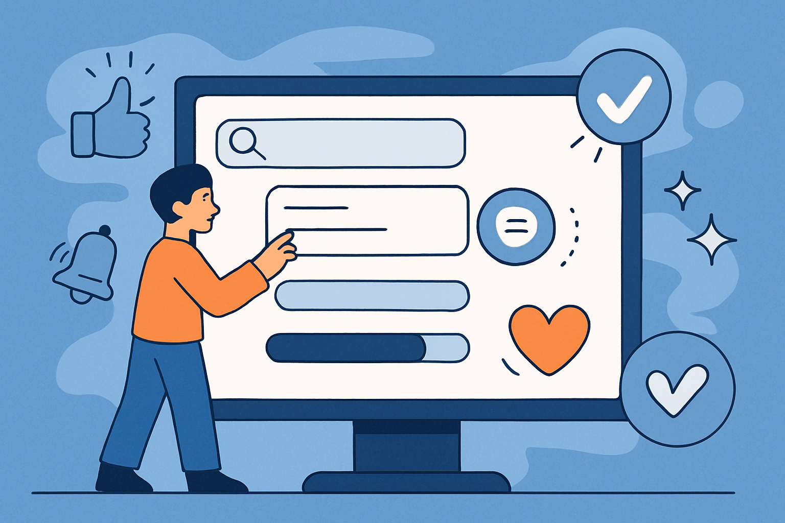
These are microinteractions — the tiny, contained moments that help users complete tasks, provide feedback, and build a sense of trust. They may be as simple as a button changing colour when clicked, a notification gently appearing to confirm an action, or a progress bar subtly filling as a page loads.
They don’t just make things look nice. Microinteractions are functional tools, rooted in user psychology, that:
- Reduce uncertainty.
- Build trust.
- Improve usability.
- Delight and engage users.
In this article, we’ll explore the anatomy of effective microinteractions, the psychology behind them, real-world examples from leading brands, and practical guidance for incorporating them into your website.
What Exactly Are Microinteractions?
A microinteraction is a small, self-contained moment in a product’s interface that does one job well. According to interaction designer Dan Saffer, every microinteraction has four components:
- Trigger – What initiates the interaction (click, hover, swipe, voice command).
- Rules – The logic that determines what happens after the trigger.
- Feedback – The response the system gives (visual, auditory, or haptic).
- Loops and Modes – How the interaction evolves over time or changes based on conditions.
Examples in action:
- The Facebook “Like” button changing colour when clicked.
- A password strength indicator that grows from red to green.
- A small tooltip appearing when hovering over a help icon.
Why they matter: On the surface, these actions seem minor. But collectively, they guide the user journey, reassure visitors that the site is responding to them, and communicate your brand’s personality.
Why They’re Critical for UX
1. Feedback & Communication
Good microinteractions close the gap between user action and system response. If you click “Add to basket” and nothing appears to happen, you’re left wondering: Did it work? Microinteractions give instant, unambiguous answers.
Examples:
- E-commerce sites like ASOS display a small animation and a side-panel cart update after an item is added.
- Banking apps show a reassuring “Processing…” animation while a payment is sent.
2. Building Trust Through Clarity
A well-executed microinteraction says: We’ve thought about you. A clunky or missing one suggests the opposite. This can be especially damaging in industries like finance, healthcare, or travel, where security and reliability are paramount.
3. Enhancing Usability
Microinteractions guide users without them needing to think about the next step. For instance, hover states in a navigation bar clearly show clickable areas, helping first-time visitors understand how to navigate.
4. Emotional Engagement & Delight
Not all microinteractions are purely functional — some are designed to make people smile. Slack’s playful loading messages and Duolingo’s celebratory animations are a big part of why users form emotional bonds with these brands.
Best Practices for Designing Effective Microinteractions
- Purpose First – Every microinteraction should exist to solve a real problem: confirming an action, guiding a decision, or making an interaction feel smoother.
- Subtlety Over Showiness – In British design culture especially, understatement is appreciated. Avoid flashy animations that feel gimmicky.
- Consistency is Key – Keep animation speeds, easing curves, and styles consistent across your site.
- Respect Accessibility – Provide motion-reduction options for those sensitive to animation. Always ensure that visual feedback is backed up with text or sound where necessary.
- Match Brand Personality – A tech startup might opt for playful bounces; a legal services firm might use calm fades and subtle transitions.
Examples from Leading Brands
- Airbnb – Map pins subtly bounce when selected, confirming the user’s click and focusing attention.
- LinkedIn – Adds a confetti animation when you reach key profile milestones.
- Apple – Uses fluid button animations to make every interaction feel premium.
- Monzo – Subtle background colour shifts during money transfers reassure users without distracting them.
How to Implement Microinteractions
Design Stage
- Map out your user journey and identify moments of uncertainty or decision-making.
- Sketch out potential microinteractions for each of these points.
- Use design tools like Figma, Adobe XD, or Principle to create realistic prototypes.
Development Stage
- For simple interactions: use CSS transitions and JavaScript.
- For more advanced animations: consider Framer Motion or GSAP.
Testing & Iteration
- Run A/B tests to measure whether your microinteractions improve conversions or reduce errors.
- Collect qualitative feedback — are users finding the animations reassuring, distracting, or invisible?
Microinteractions & Conversion Optimisation
Well-placed microinteractions can directly influence conversions:
- Progress indicators in checkout forms reduce abandonment by showing users they’re close to completion.
- Inline form validation prevents error frustration, encouraging completion.
- Subtle “nudges” like a pulsing CTA button can increase click-through rates without feeling pushy.
Conclusion: Small Details, Long-Term Impact
Microinteractions may be small, but their impact on user experience is significant. They build trust, remove uncertainty, and create moments of delight that make users feel confident and valued.
If your website feels “flat” or users seem disengaged, the solution might not be a full redesign — it could be as simple as improving the tiny moments that shape the way users feel as they interact with your site.
At The Website Design Agency, we design with these details in mind — blending beauty, usability, and psychology to create experiences that convert.