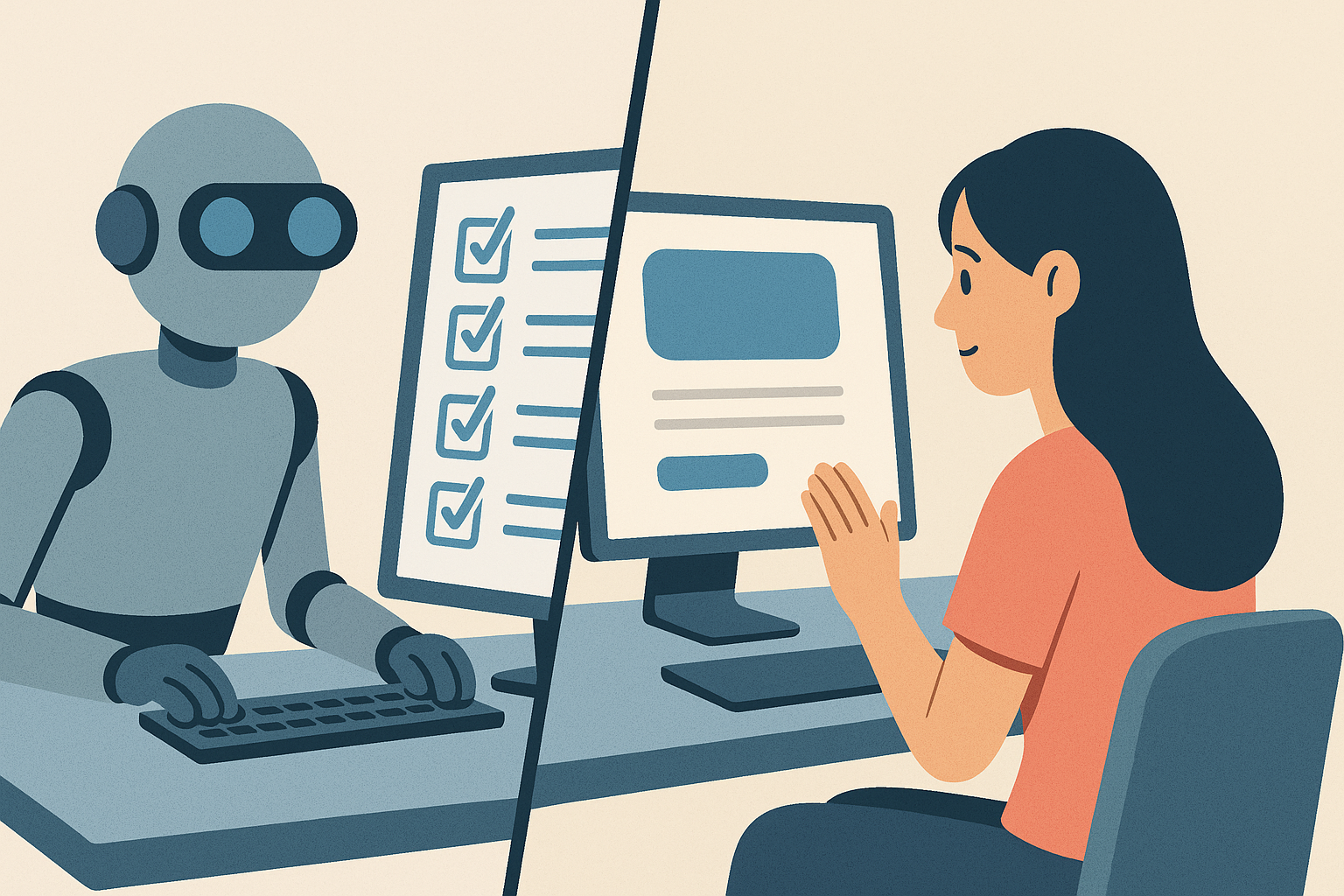
In the pursuit of higher Google rankings, it’s easy to lose sight of who your website is truly for—your audience. Many sites are built with search engines in mind first and people second. This may work in the short term, but in the long run, it undermines engagement, trust, and conversions. Google has caught on too; algorithm updates now reward user-centric content, design, and performance as key ranking factors.
At The Website Design Agency, we’ve helped countless businesses strike the right balance between technical SEO and meaningful user experience. Here are five clear signs that your website is geared more towards bots than people—and what you can do to fix it.
One of the most obvious signs your website is written for Google is awkward, keyword-stuffed content. This kind of copy repeats phrases unnaturally and sacrifices flow for search terms. While keyword optimisation is still part of good SEO, search engines have become much more sophisticated. Google's NLP (Natural Language Processing) algorithms can now interpret context and intent without needing excessive repetition.
If your service pages are filled with phrases like "best plumber in Birmingham for plumbing Birmingham homes," it’s time for a rewrite. Users instinctively tune out content that feels spammy or inauthentic. Worse, it erodes your brand's credibility and sounds amateurish.
Instead, focus on clarity, conciseness, and tone. Use keywords sparingly and strategically—place them in headings, metadata, and the first 100 words of content. Use tools like SurferSEO or Clearscope to assess readability and keyword density, but never sacrifice tone and natural flow just to tick a box.
Look at how brands like Innocent Drinks write: plain English, human tone, and engaging language that’s still SEO-conscious. You can be both searchable and likeable at once.
If your website contains numerous near-identical pages targeting different cities or keywords, you’re likely diluting your authority. This type of “thin content” offers little value to users and is often flagged by search engines. For example, having ten separate pages titled "Web Design in [City]" that say the same thing doesn’t help users make informed decisions.
Repetitive pages confuse users, especially when the differences are barely noticeable. They also fragment your SEO potential. Rather than building one high-authority, comprehensive resource, you end up spreading value thinly across several underperforming pages.
Instead, consolidate your content into deeper, richer pages. Group related services together or build long-form location hubs with contextual relevance. Add testimonials, FAQs, local case studies, or video walkthroughs to differentiate the content and make it genuinely useful.
Remember, Google's Helpful Content Update specifically targets sites that publish content solely to rank, not to help. If you wouldn't find your page helpful as a visitor, neither will Google—or your prospects.
SEO-optimised websites often suffer from bloated layouts: huge walls of text, too many internal links, keyword banners, and popups galore. The intention is clear—drive SEO metrics. The outcome? Poor usability. Visitors get overwhelmed, distracted, and frustrated, resulting in high bounce rates and poor conversions.
User-friendly design relies on visual hierarchy, scannability, and intuitive navigation. This means clean typography, balanced white space, consistent spacing, and an emphasis on clarity. Don’t bury your CTAs under link-heavy paragraphs or sidebar widgets. Guide users naturally through the page, from headline to conversion.
Modern UX tools like Figma and Adobe XD allow wireframing with a focus on hierarchy before content is even added. Combine this with CRO tools like Hotjar to track where users actually click or drop off. We’ve seen huge results by simplifying layouts and placing trust signals—like testimonials or accreditations—in the right visual spots.
Your site should feel effortless to use. Take cues from brands like Monzo or Notion: clean, focused, and distraction-free, yet still rich with information.
Many so-called “optimised” websites are ironically slowed down by the very tools and plugins meant to boost SEO. Bloated WordPress themes, third-party tracking scripts, cookie popups, and overuse of visual assets can dramatically impact load times.
Users expect a page to load in under 3 seconds—on mobile, ideally even faster. Every extra second of delay increases bounce rates and drops conversions. Google’s Core Web Vitals algorithm updates explicitly reward fast, stable sites, with LCP (Largest Contentful Paint) and CLS (Cumulative Layout Shift) being key benchmarks.
We recommend conducting regular speed audits using Lighthouse or GTmetrix. Optimise images, defer scripts, and consider switching to lighter themes or headless CMS platforms. Use CDNs (Content Delivery Networks) like Cloudflare to serve assets faster globally. And always test on real mobile devices, not just emulators.
Page speed isn’t just a tech metric—it’s a real-world user experience issue. Your website might be ranking, but if users bounce before engaging, you’re throwing away opportunity.
Websites built with SEO as the only priority often forget what happens after the user arrives. They rank well, but fail to convert. Why? Because there's no intuitive next step. No call-to-action. No reason to stay. No sense of direction.
Every page on your website should have a clearly defined purpose and conversion point. Whether it’s downloading a brochure, booking a call, or reading a case study—users should never be left wondering “what now?”
Effective conversion paths are created through smart layout, strong CTA design, strategic internal linking, and frictionless forms. Use contrasting buttons, sticky nav elements, and language that creates urgency or clarity. A/B testing tools like Google Optimize or Convert.com can help refine this over time.
One key tip: reduce decision fatigue. Give users fewer, better options. Avoid burying your contact button in the footer. Instead, guide users toward it with persuasive, well-timed touchpoints.
It’s tempting to chase Google rankings at all costs—but when you forget about your users, the results rarely last. Search engines now reward the same qualities that humans do: clarity, speed, relevance, and trust. The best-performing websites today are those that put people first and use SEO to support that goal—not define it.
Wondering where your current website stands? 📧 Drop us a line or book a UX + SEO audit. We'll help you balance technical performance with human impact—and build a site that performs for everyone.